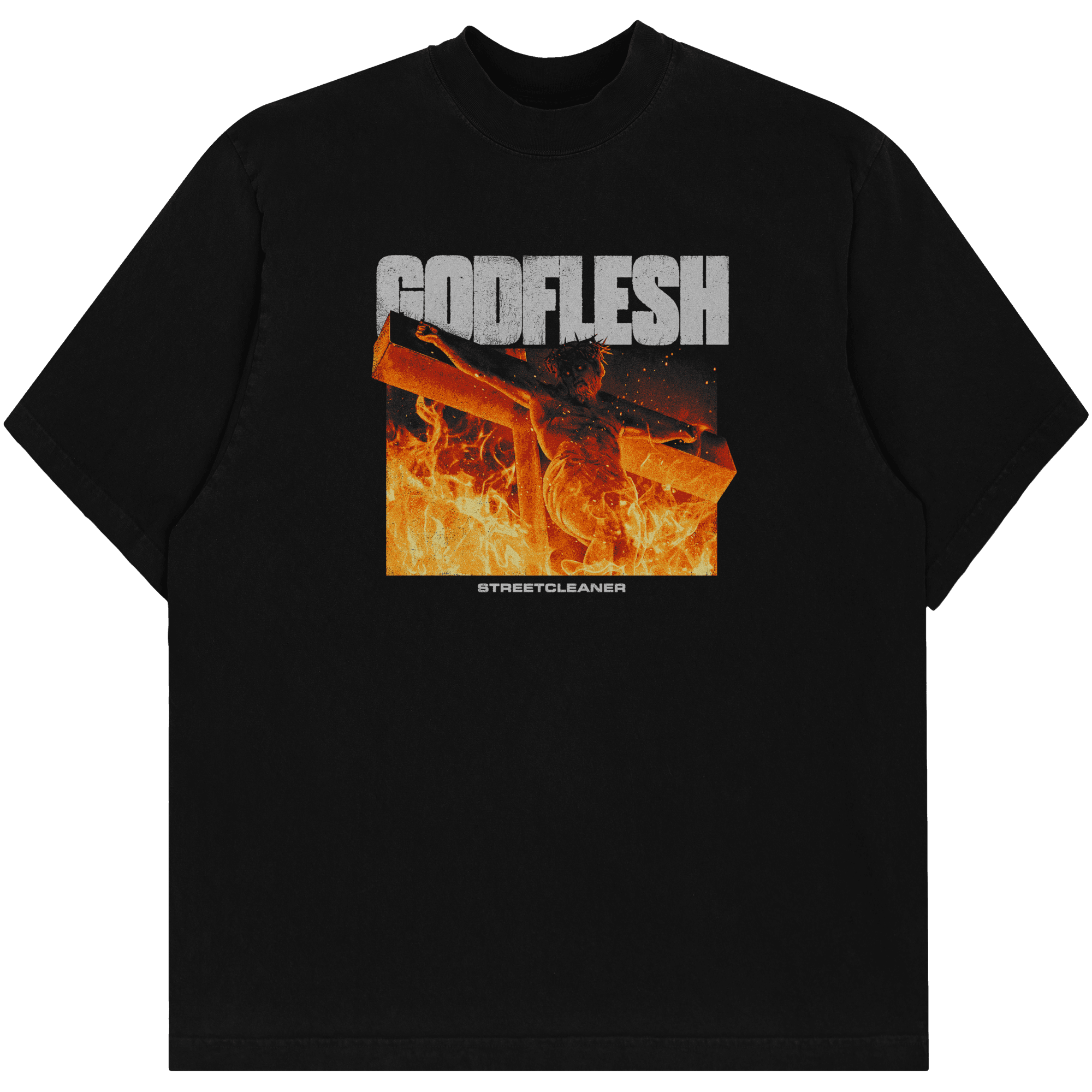
"GODFLESH"
A conceptual piece inspired by Godflesh. I took an image of a crucifix and redirected the lighting to create an underlit / backlit light composition to give it a more dramatic and cinematic feel. This was achieved by flattening the lighting, and hand painting in new lighting through the use of colour curves and layer masks.
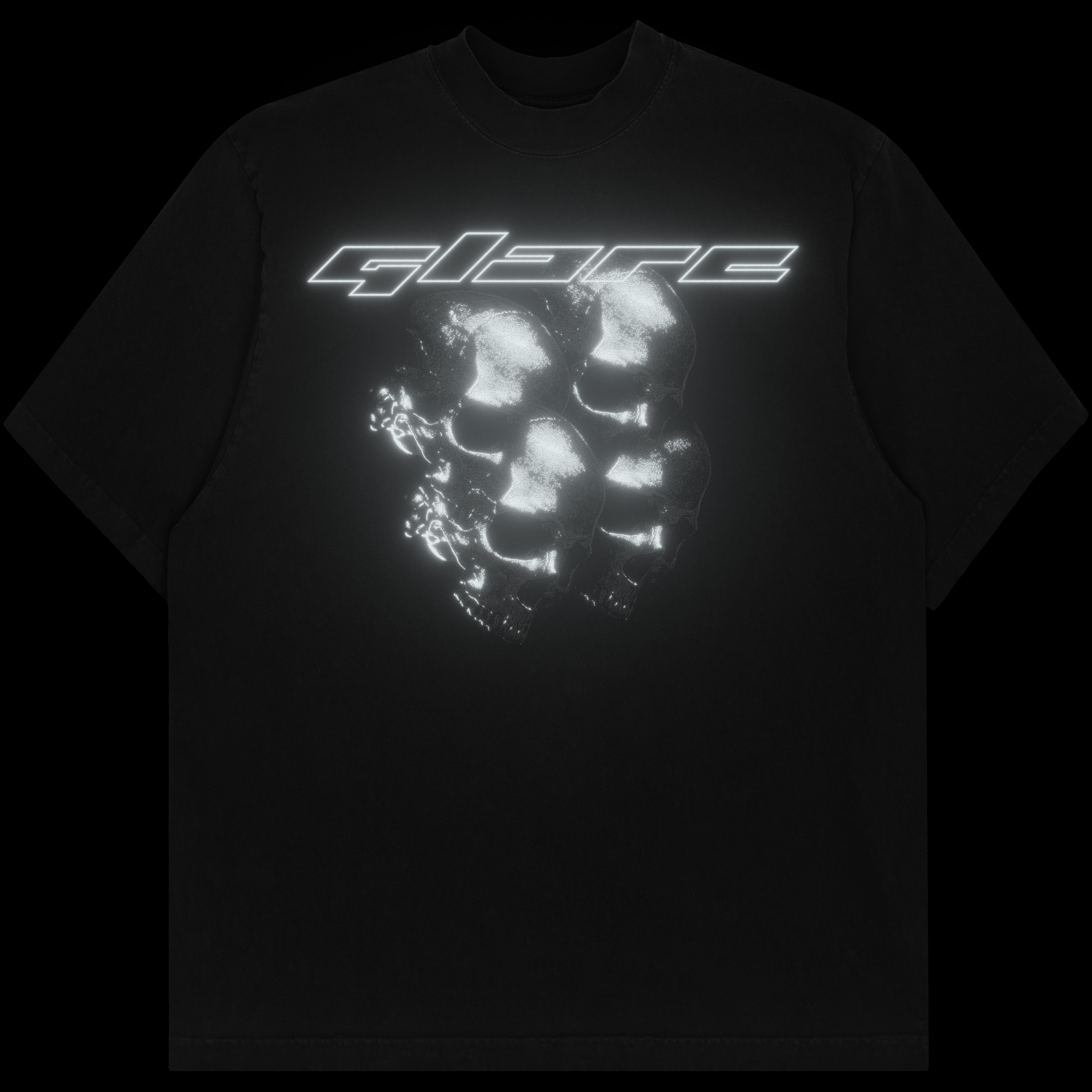


GLARE - KALEIDOSKULL
A merch print for shoegaze band Glare, making use of reflective DTF printing to create a glittery and 'anti-paparazzi' effect. The design makes use of stacked skulls though the use of masking and blend modes. Featuring bespoke typography in a vectorheart / corporate-cyberpunk style.

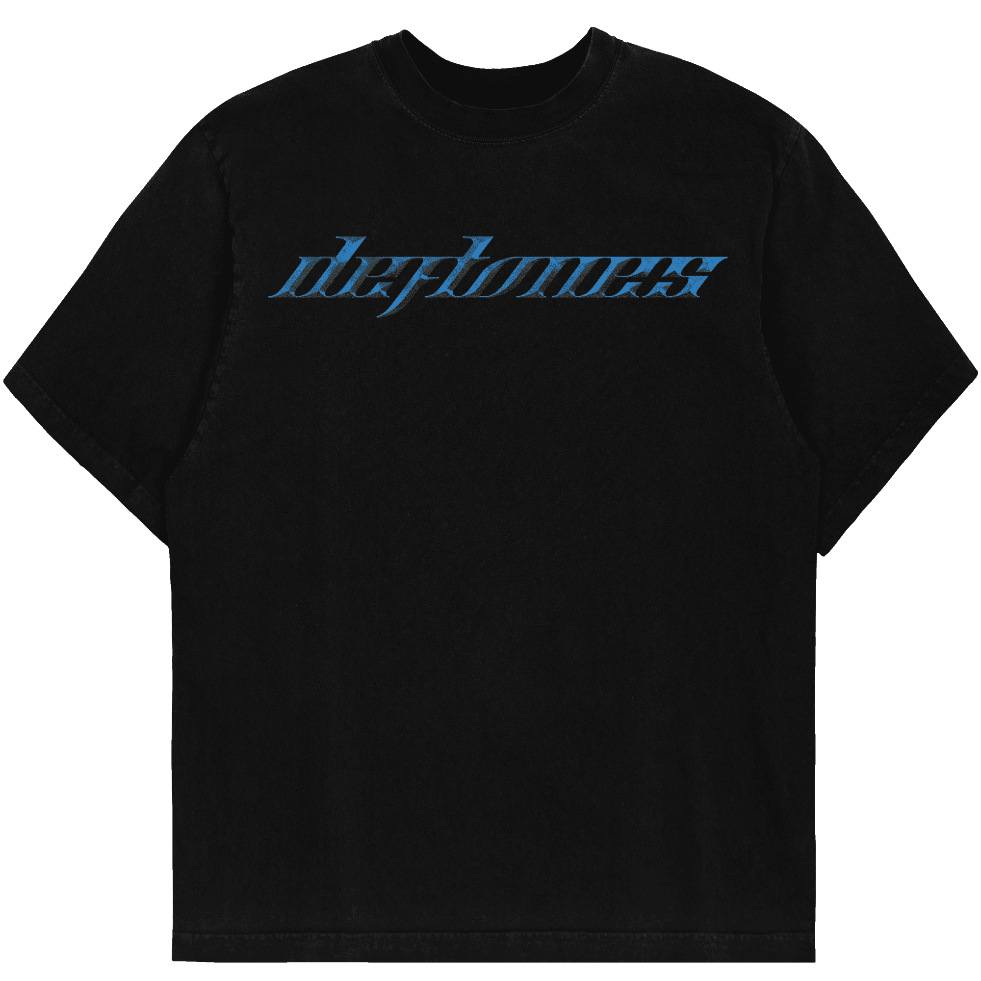

"AROUND THE FUR"
A conceptual piece based on one of my favourite albums of all time. Inspired by 90's merchandise printing, this piece uses a custom dithering engine using oversized stochastic dots to create an ink bled look. Also features bespoke and chromed typography using a custom font I've been building, I have dubbed "Mascara".

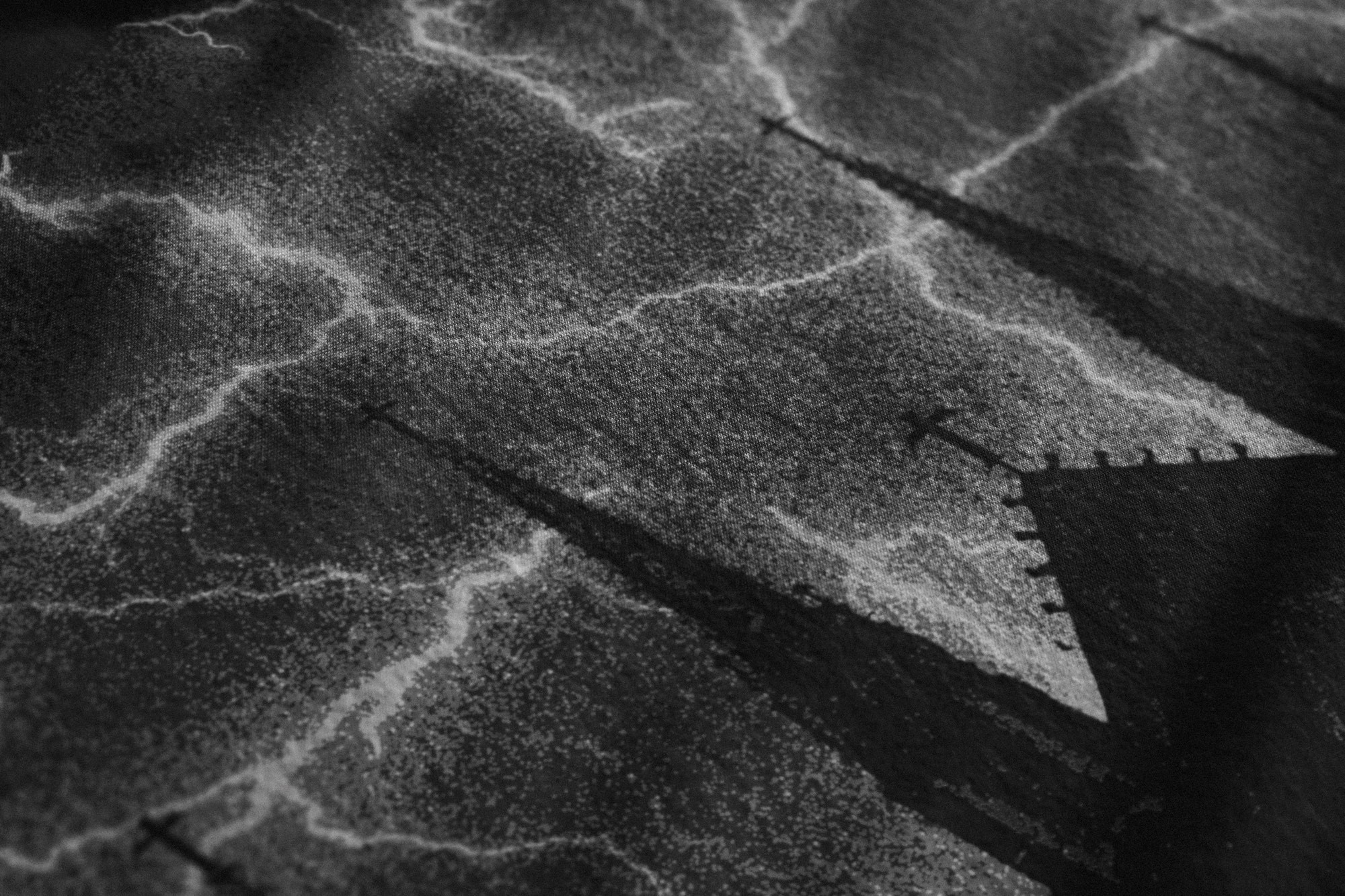
ECHOS - LIGHTNING
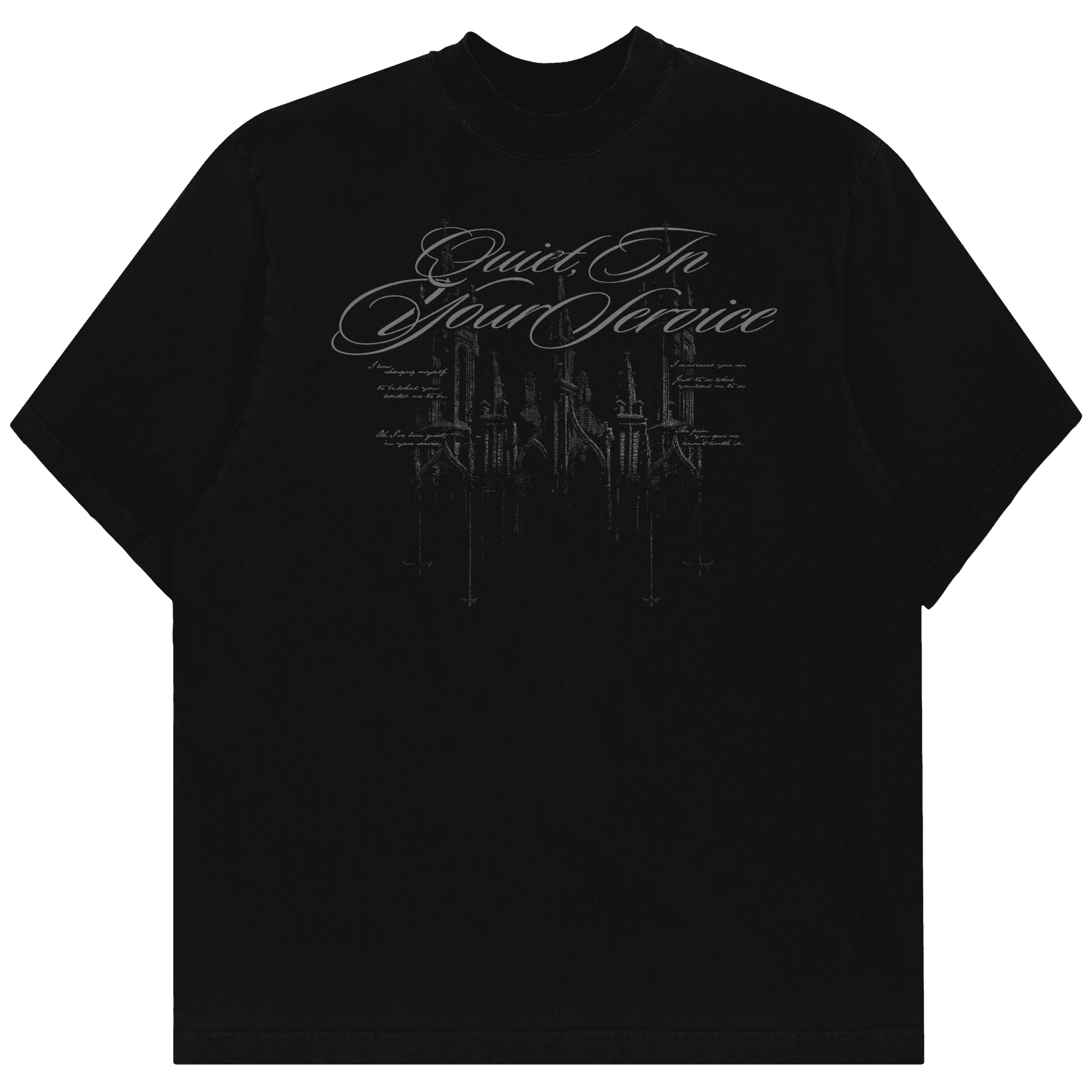
A dark and gothic merchandise piece for Echos and her latest 2026 Summer Collection. By taking the Cruciform emblem (derived from the logotype I designed for her) I designed as part of her branding, I hand painted a lightning storm in the sky to mirror its shape. Below the storm is a church creating a negative space via its silhouette. The Cruciforms are also present atop its spires.
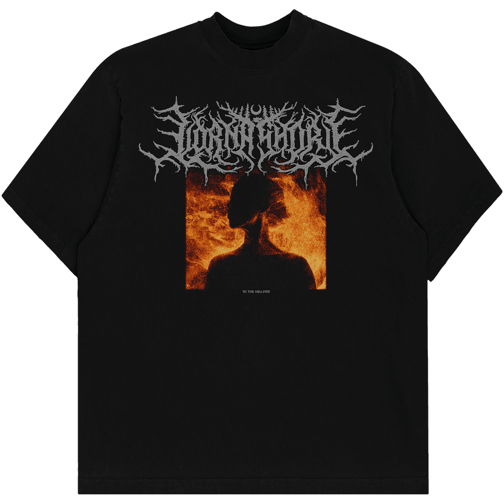

LORNA SHORE - TO THE HELLFIRE
A DTG printed merchandise design for Lorna Shore, commissioned in 2023. Featuring a woman underlit and wrapped in custom flames.
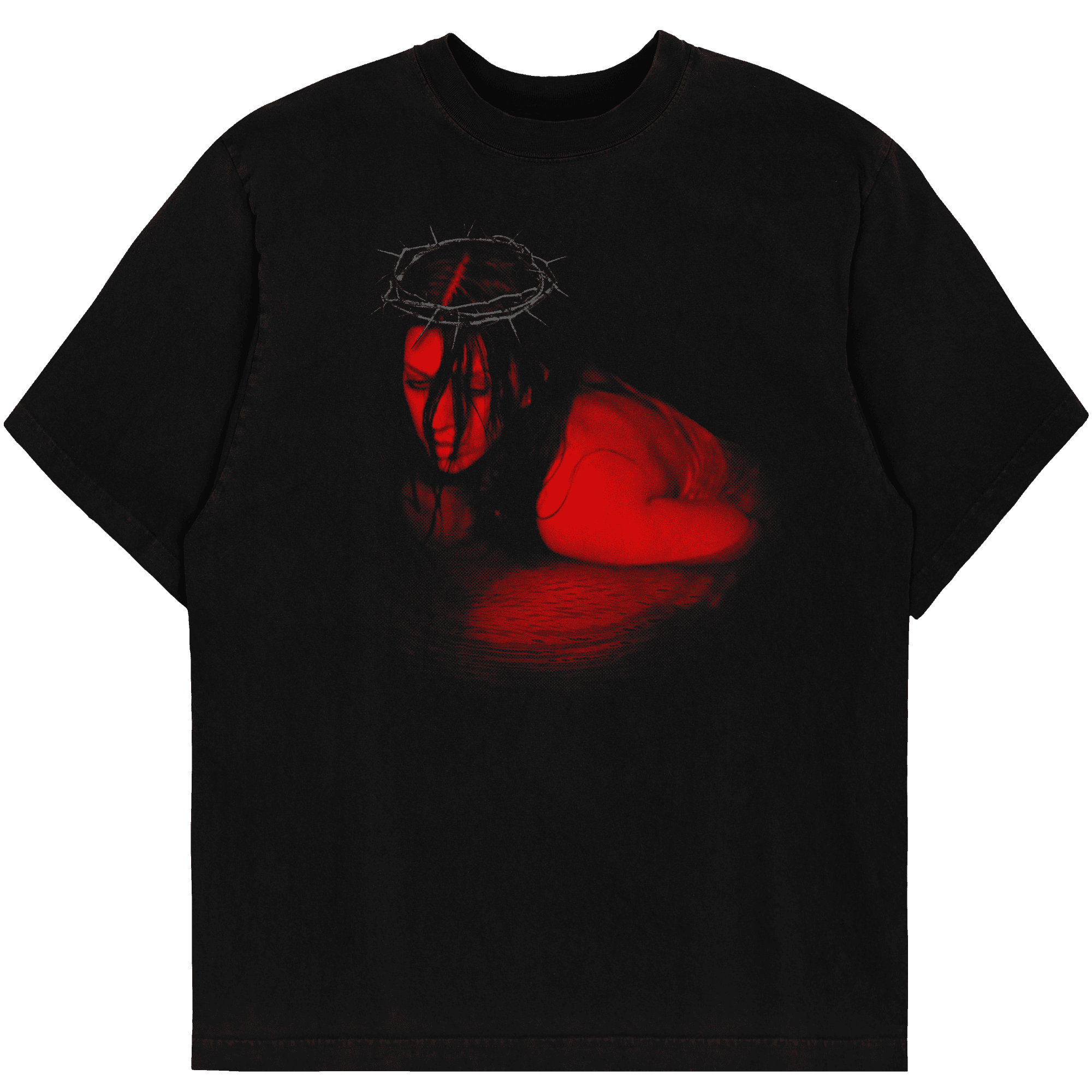
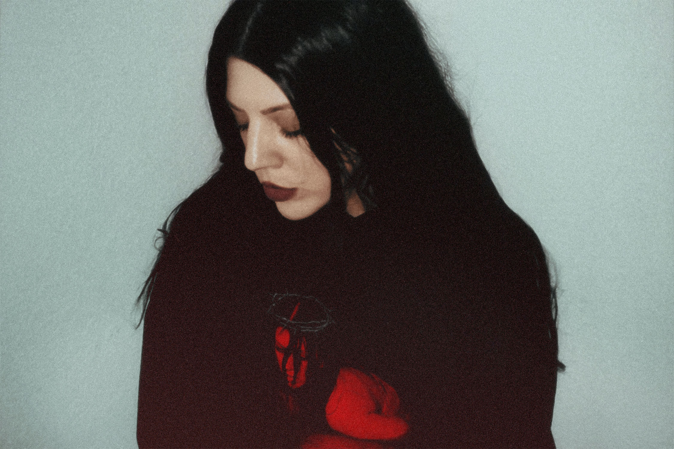
ECHOS - CROWN OF THORNS
A DTG print for Echos, featuring an image of her crouched within a lake, I superimposed a crown of thorns above on her head. We decided against any typographic or branded elements to create a more lowkey piece for her wider 2025 Summer collection.
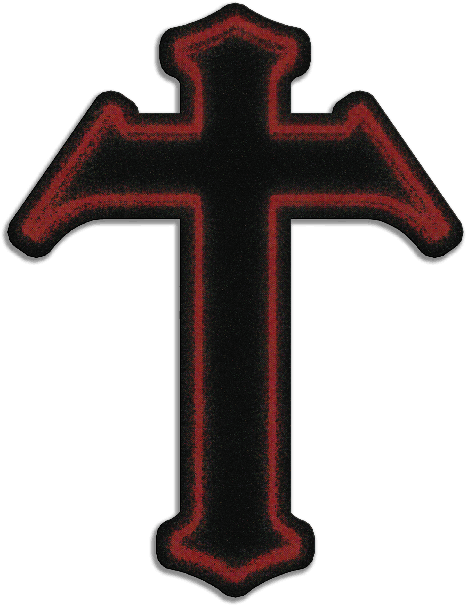

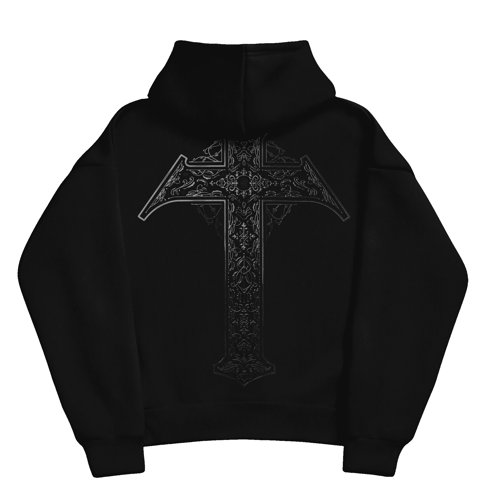
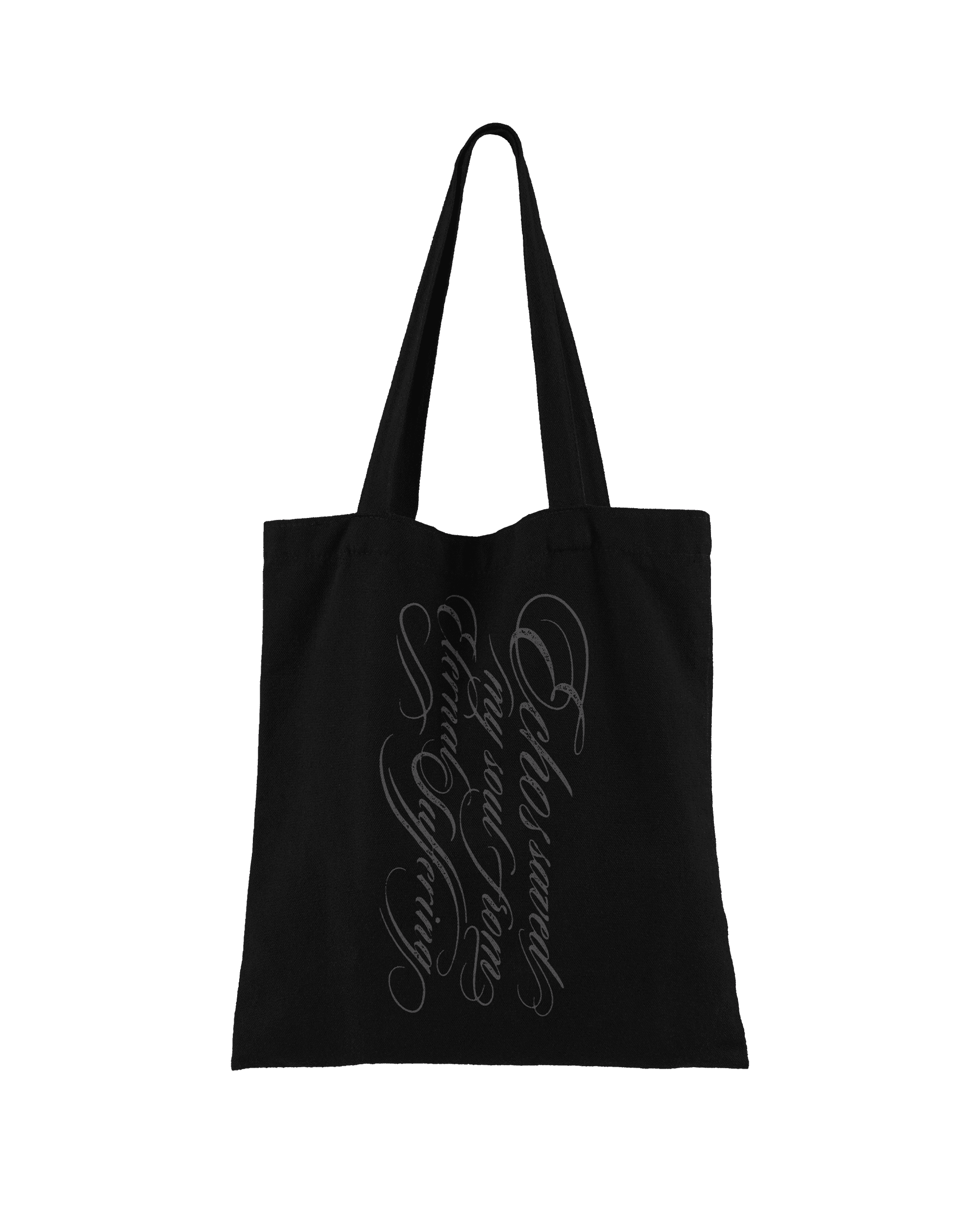
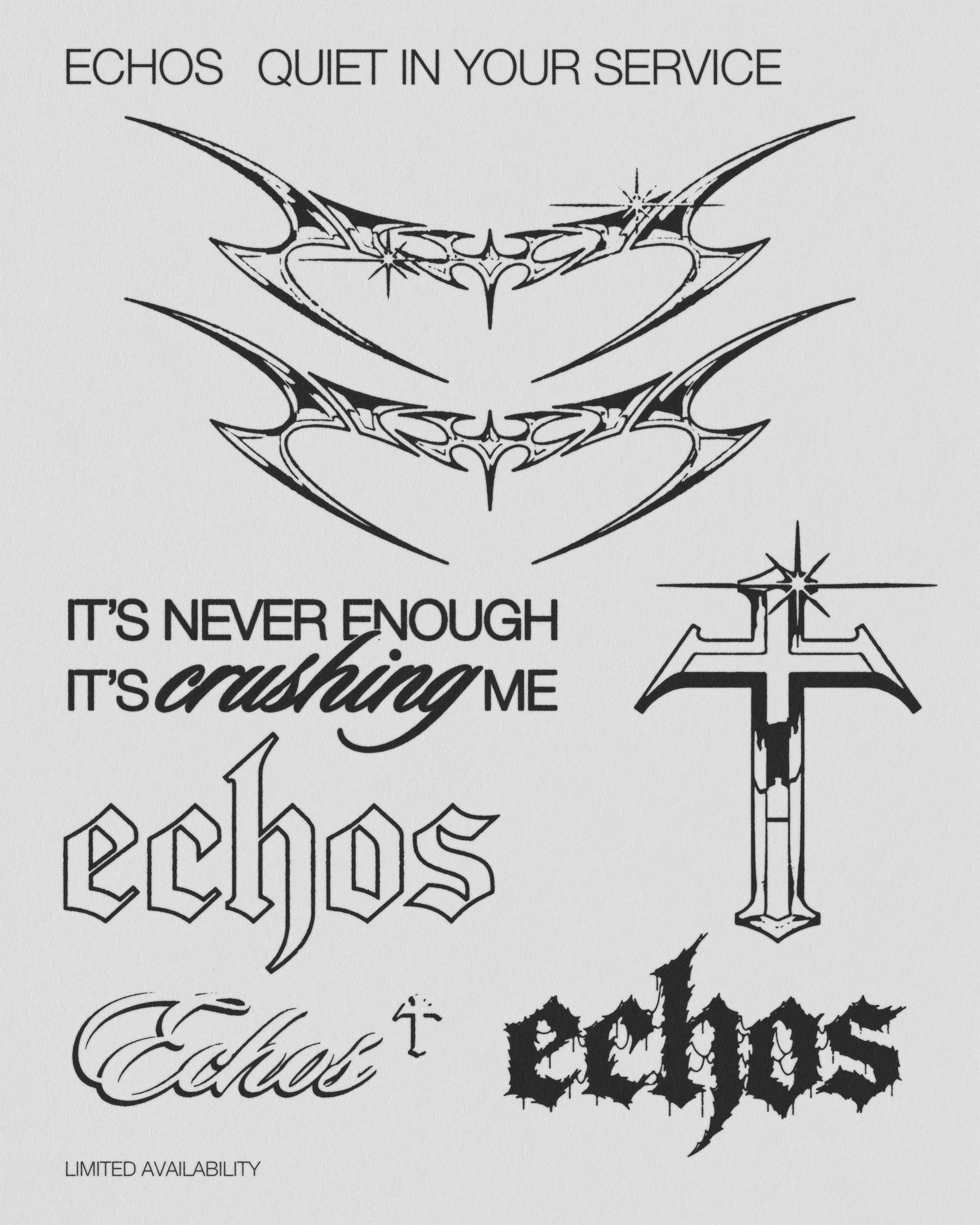
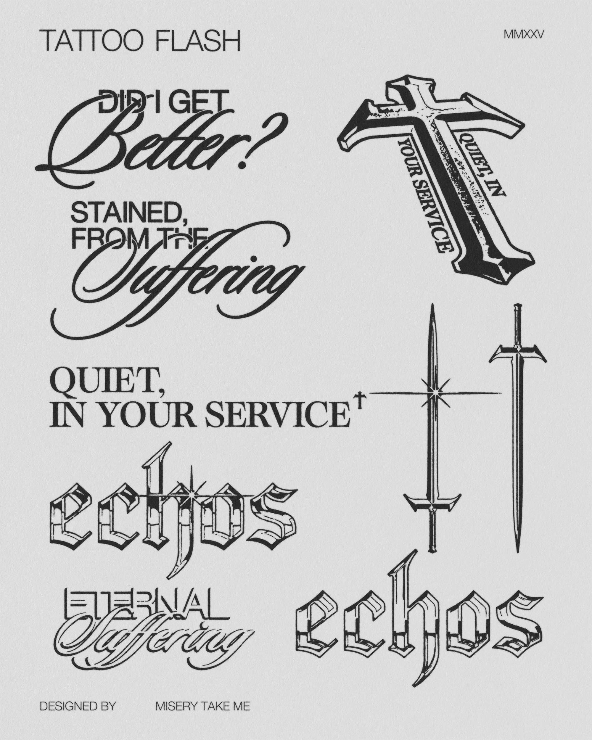
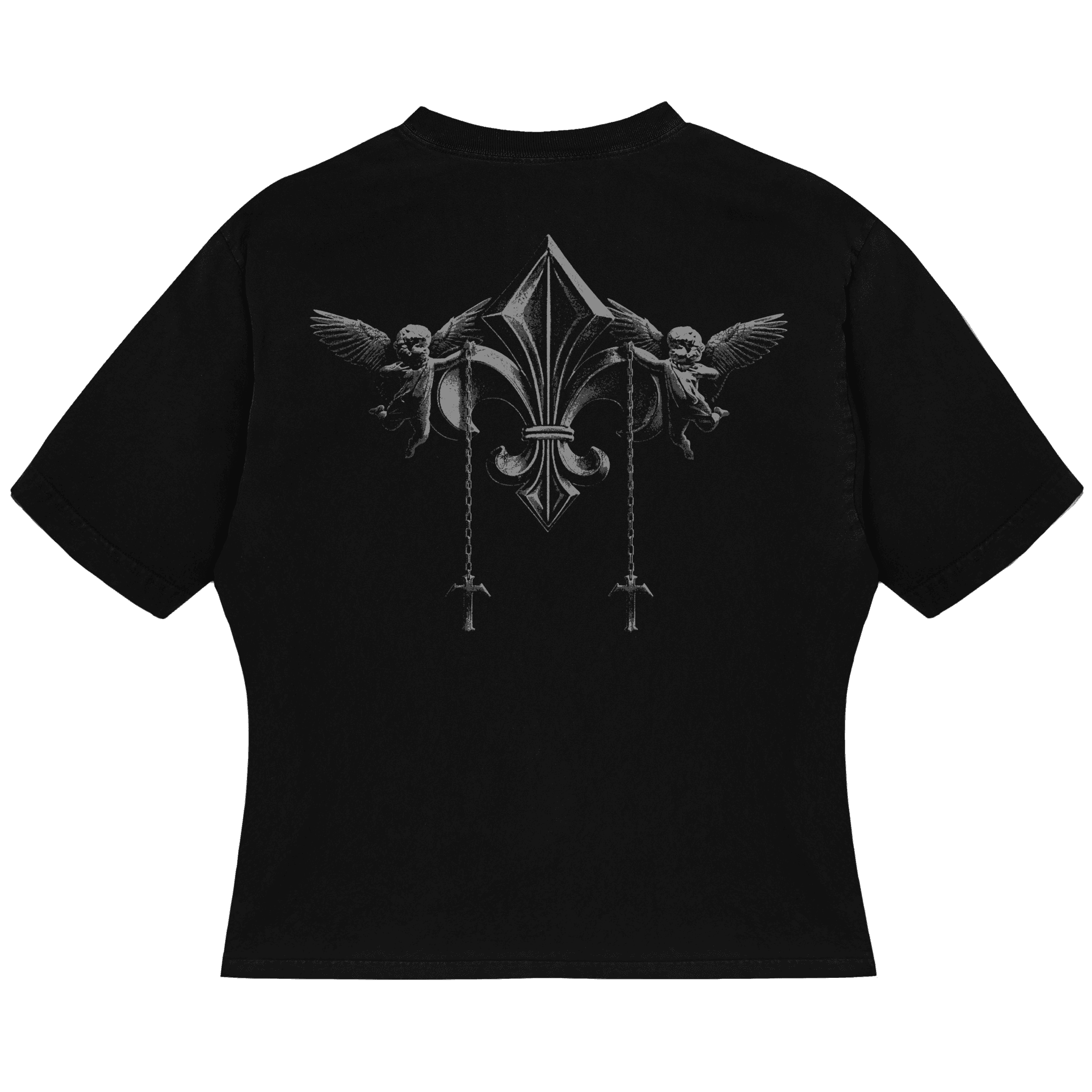
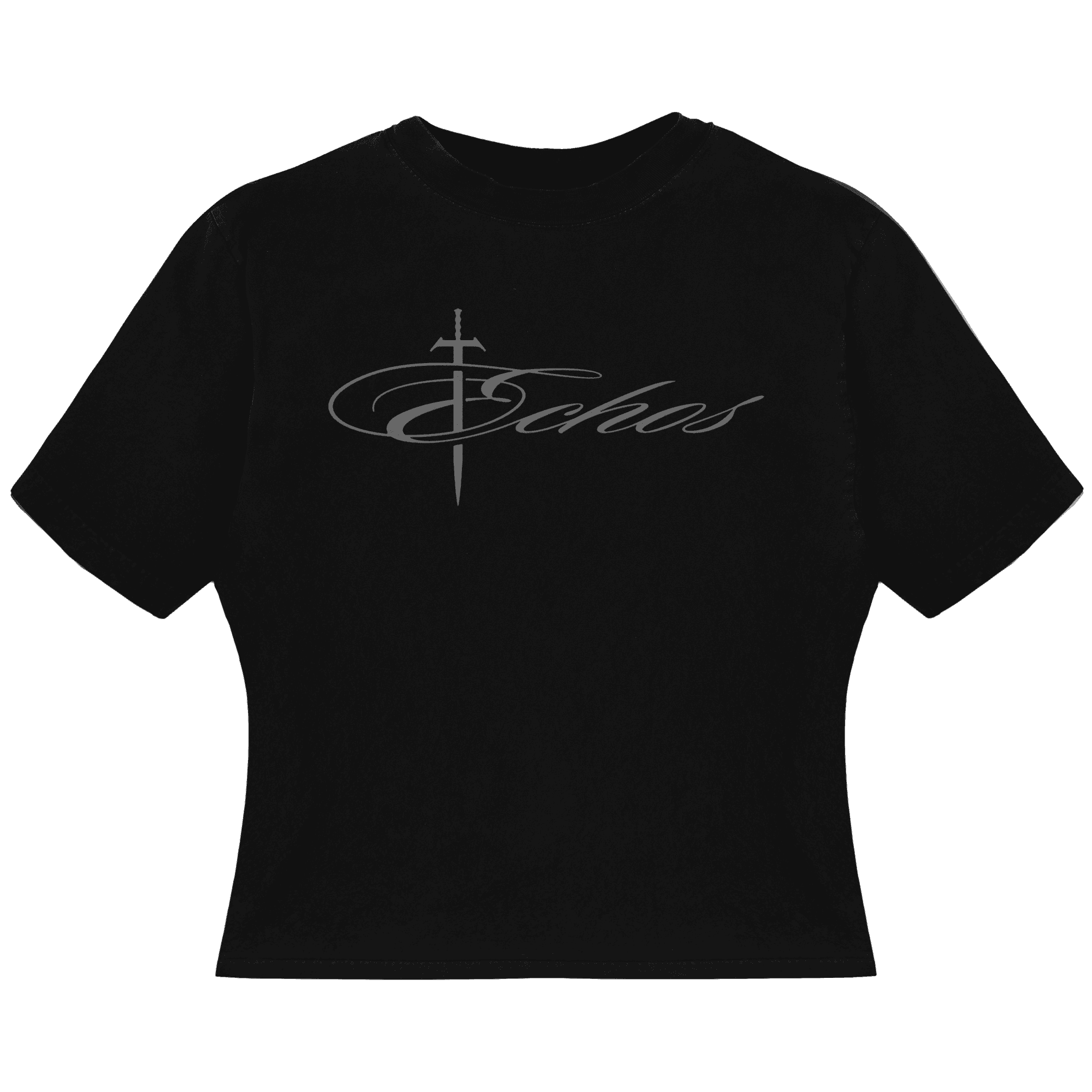
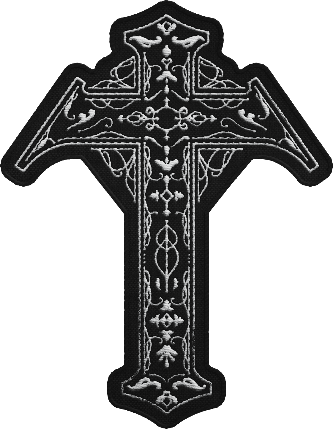
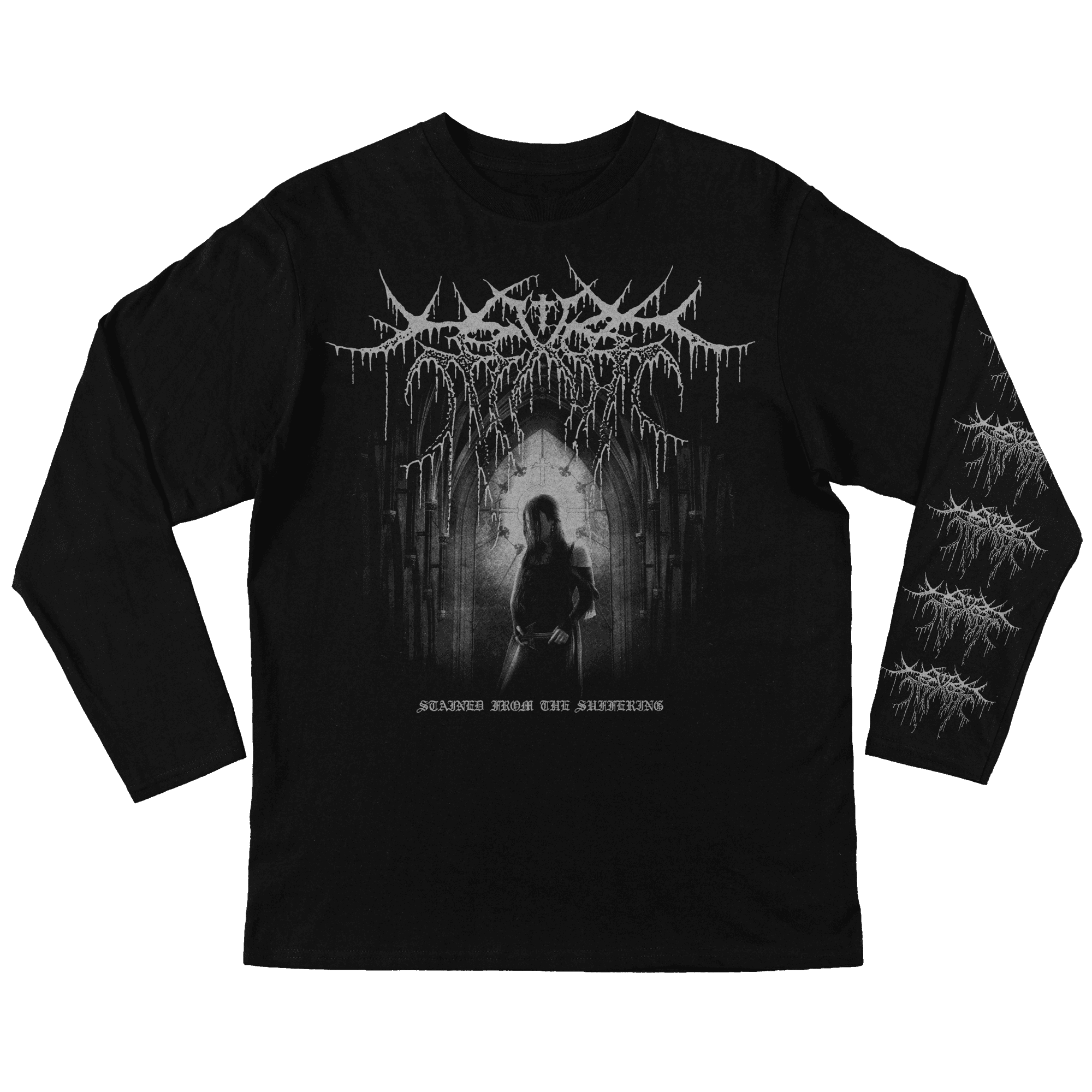
EVERY USE OF THE ECHOS CRUCIFORM
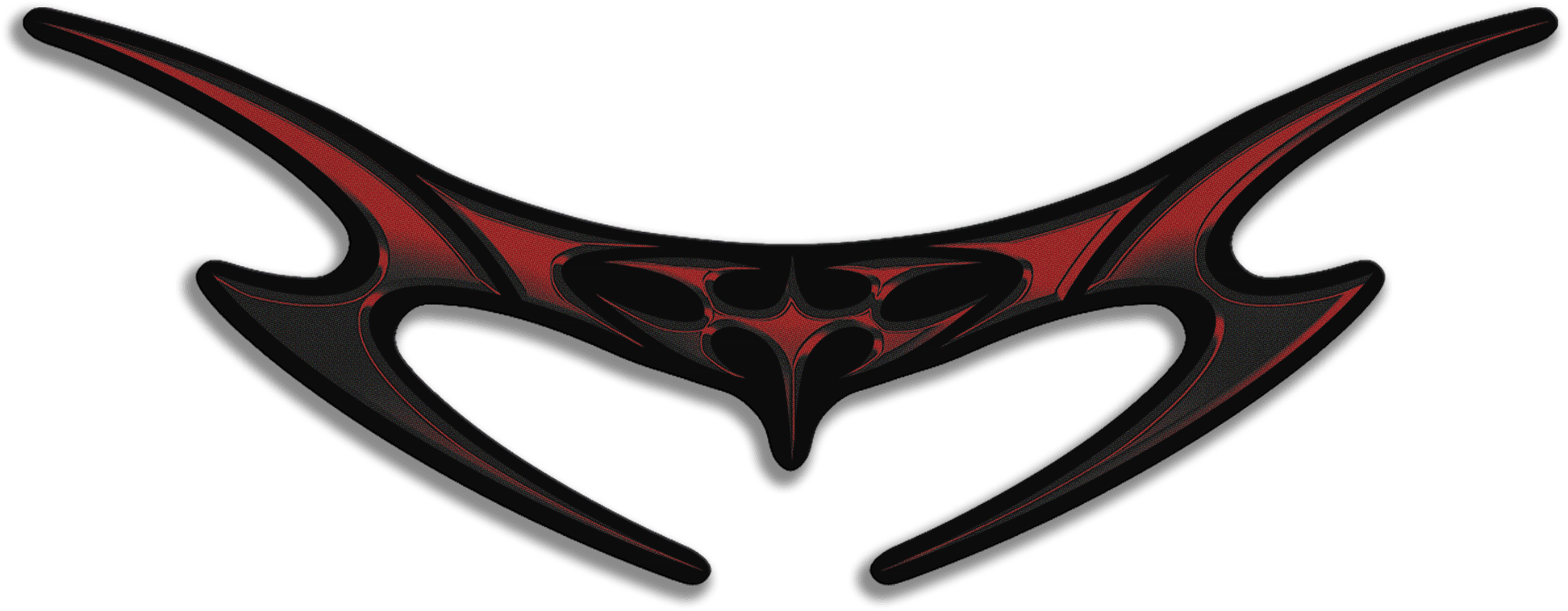
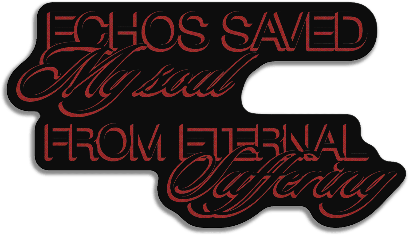
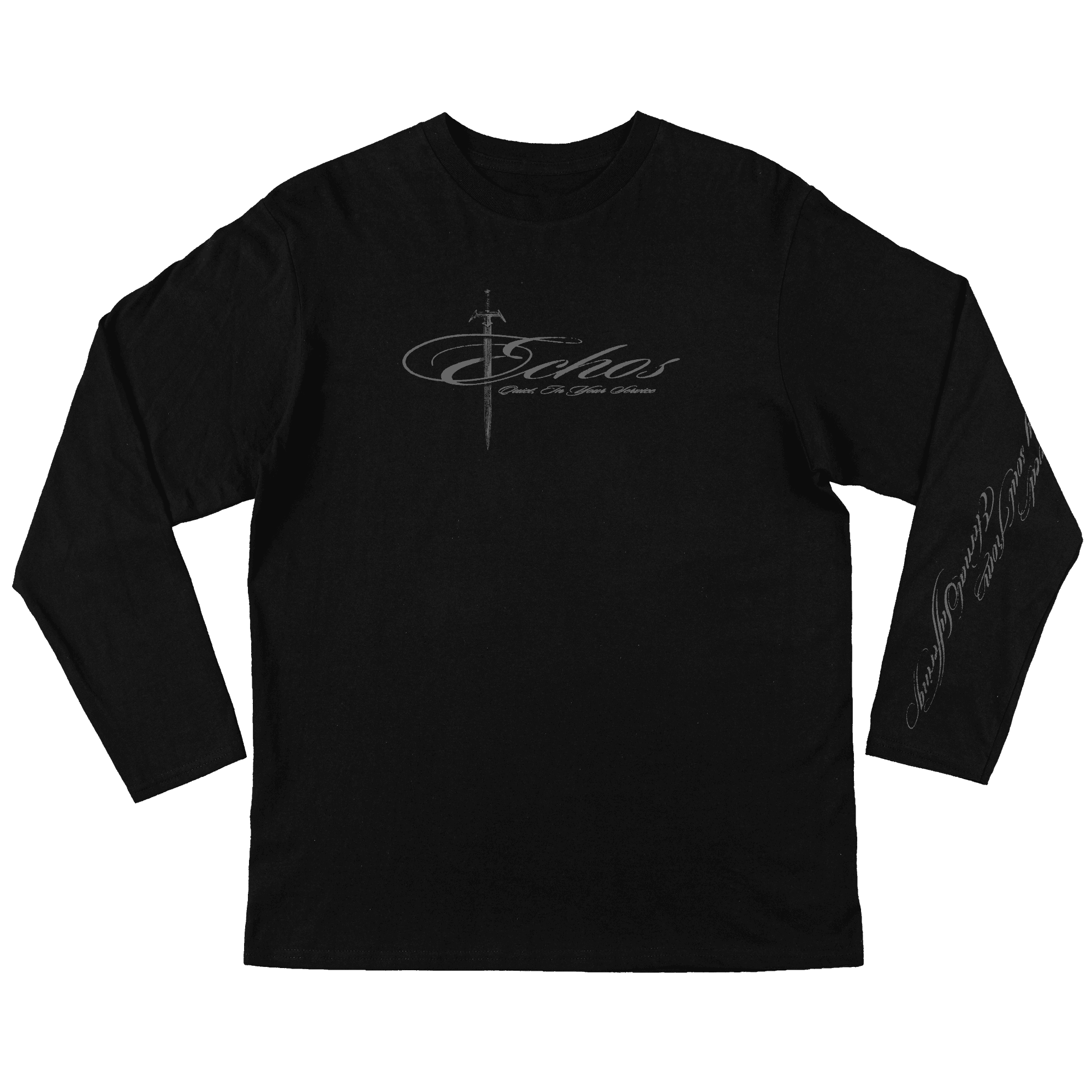
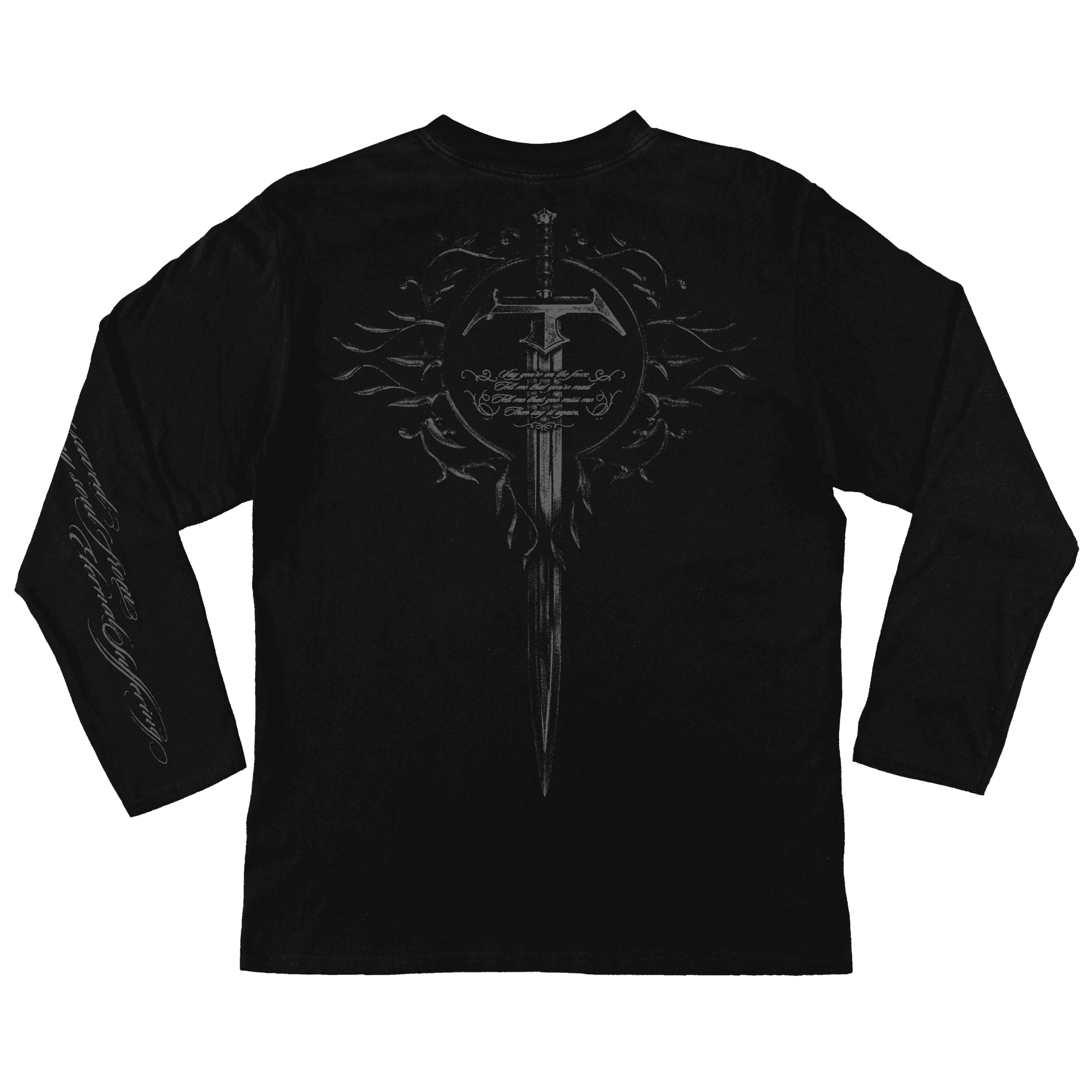
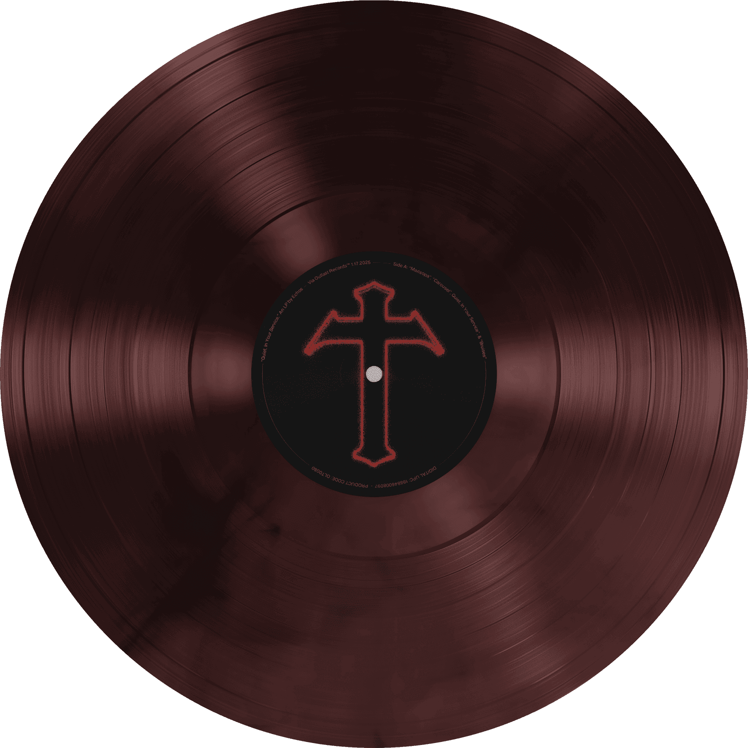
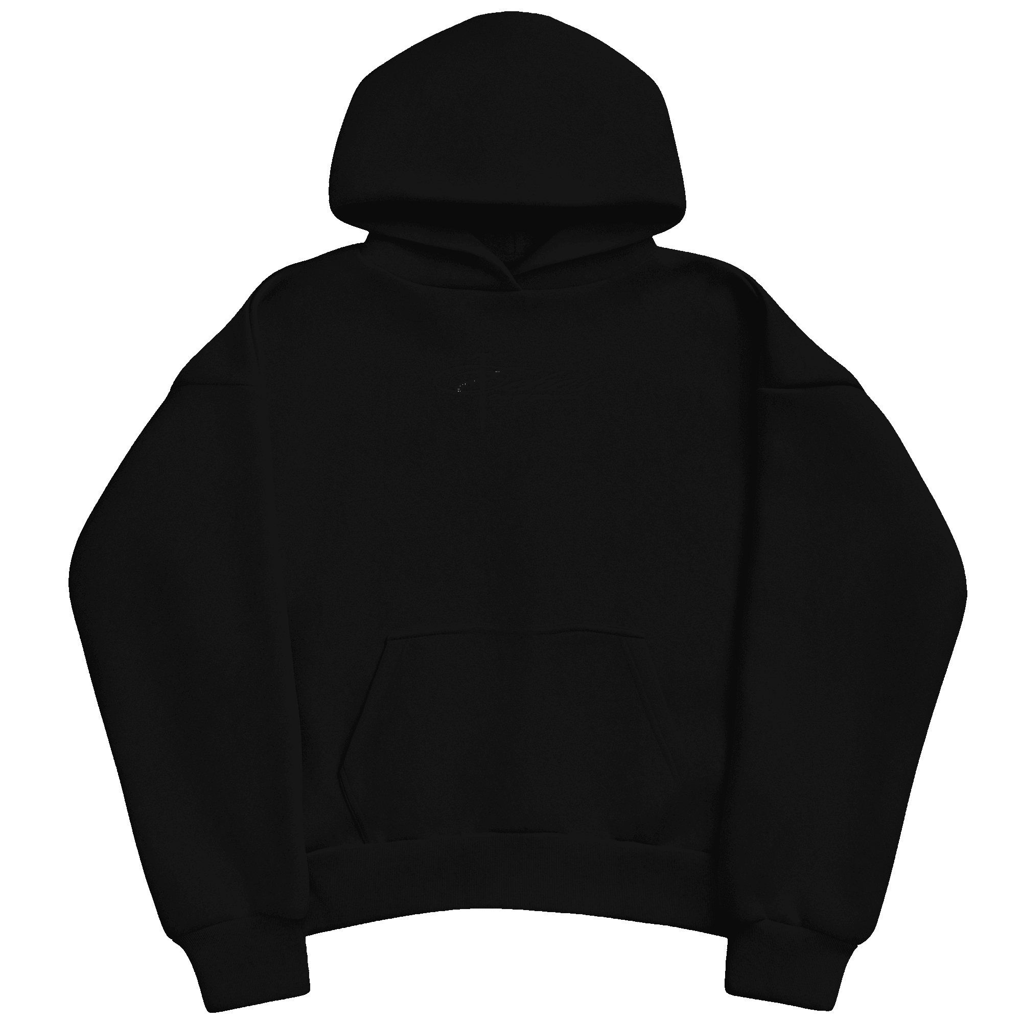
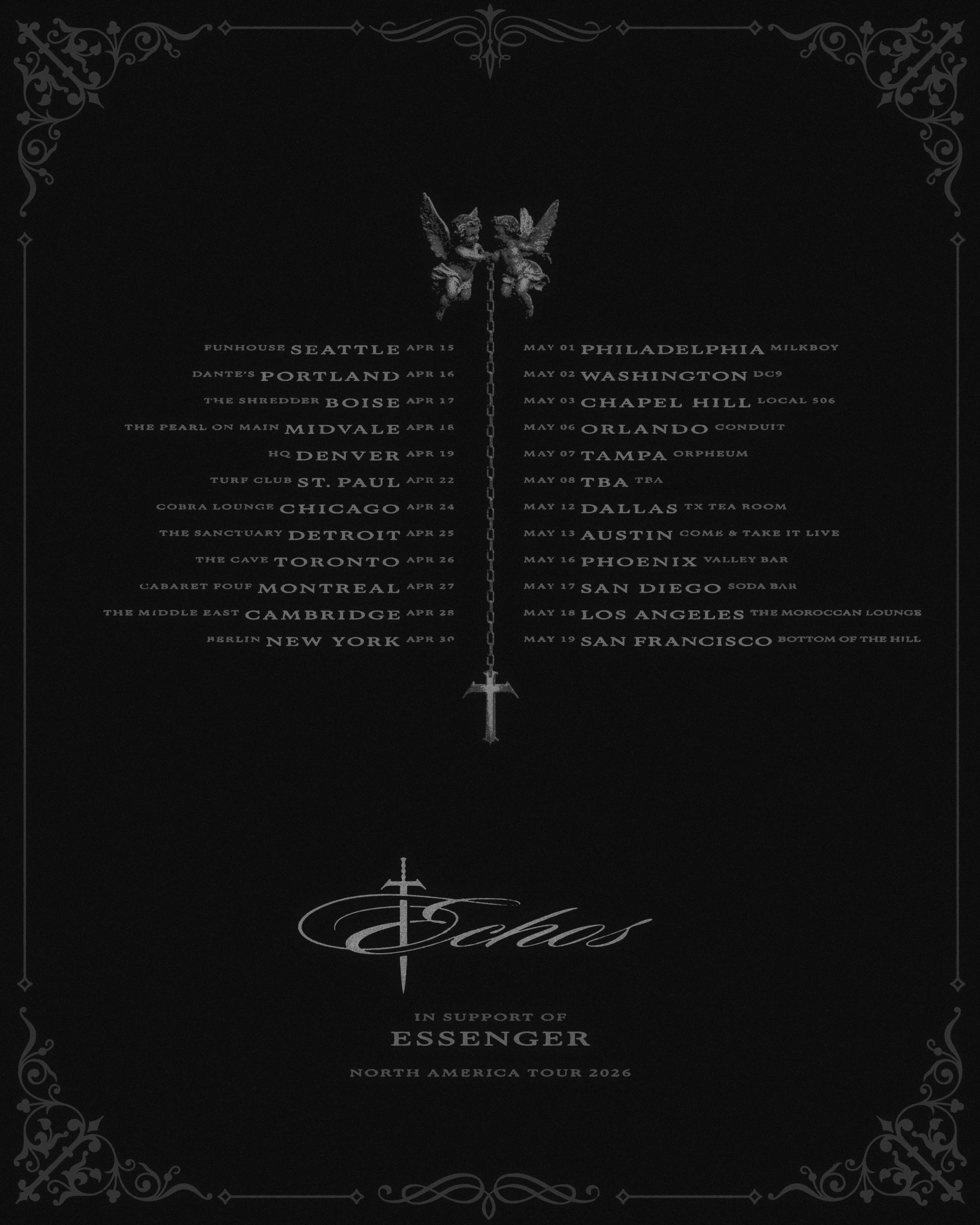
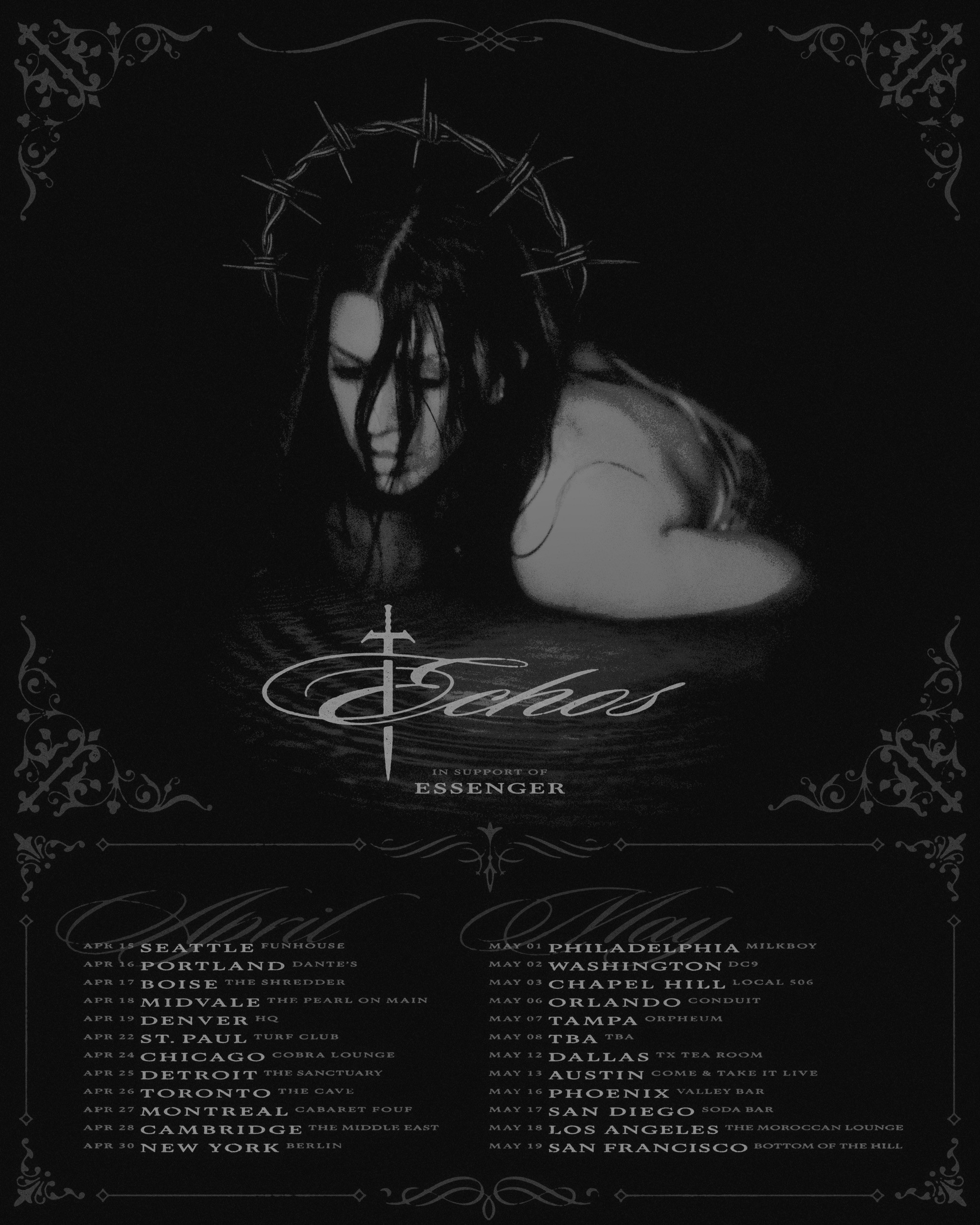
In our call I briefly mentioned the branding I had created for Echos, and how I have derived this into a load of designs for her; ranging from merchandise, to sticker designs and tattoo flash.
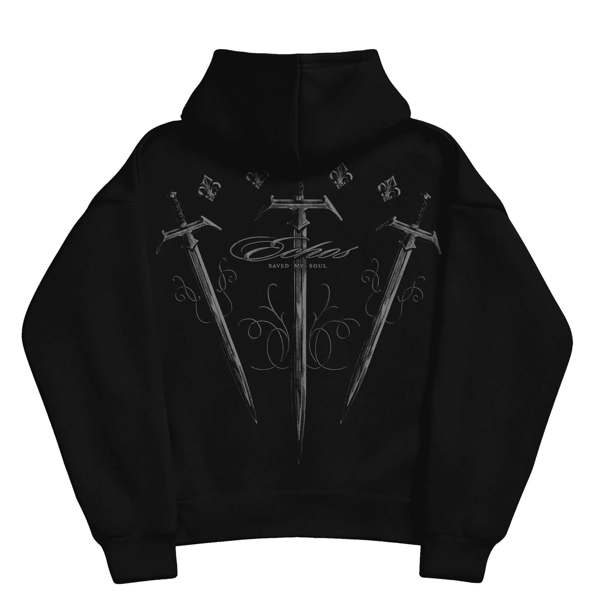
The Cruciform began by taking shapes from the bespoke geometric blackletter logotype I designed for her (shown above), and has since evolved into other forms such as sword hilts and other motifs throughout our work. She's even turning it into jewellery which is pretty sick!
Below is a select gallery of ways I have utilised this Cruciform in different pieces to create monuments and other graphical and compositional elements.








Thanks for looking!
Let me know if you need anything else at all from me, or have any questions about how I work - happy to just chat about it all!